:max_bytes(150000):strip_icc()/BridesxMinted-2024-Moodboard-Recirc-0c7670c22bc84471ad6388a3a8167ec7.jpg)
Photo by Perry Vaile / Design by Brides
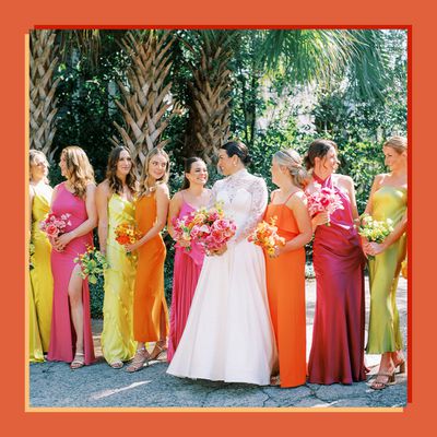
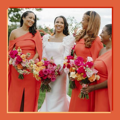
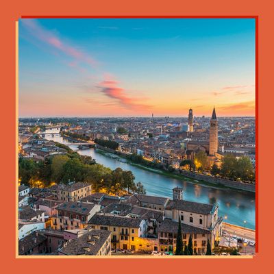
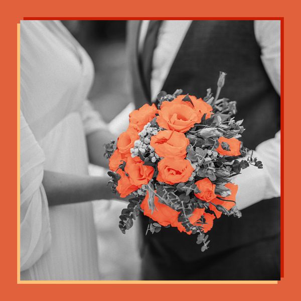
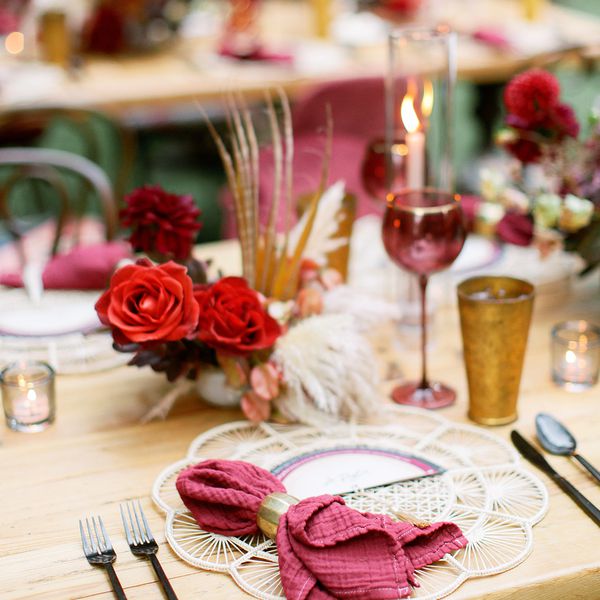
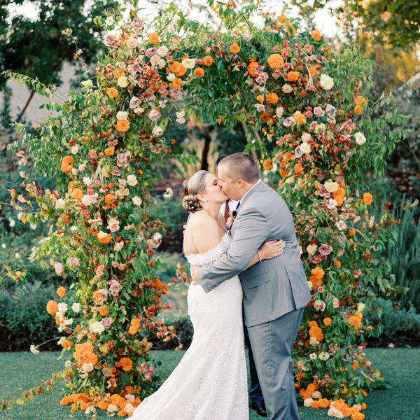
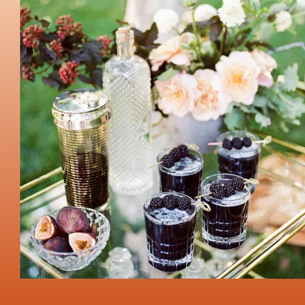
In the world of weddings, color is back, which is something we’ve been saying for years. Bright and bold shades add complexity to big-day design-scapes and are one of the best tools couples have to differentiate their event from ones that have come before. It’s why we’re so passionate about Verona Sunset, the Minted + Brides Wedding Color of the Year 2025. Sure, the vibrant orange packs a punch on its own—but when configured with other shades, it can shoulder all kinds of vibes and aesthetics. To prove just how versatile this shade truly is, we tapped three wedding planners with distinct design styles and asked them to show us exactly how they’d use this color if a client asked them to take it and run.
The mood boards you’ll find below prove that Verona Sunset looks good in just about any wedding color story: It has main character energy when placed in a primary role, supports other bright shades when used as a secondary tone, and livens up otherwise neutral, organic events when used sparingly. Yes, you heard that right: There certainly is a way to use a color as bold as orange in a subtle way. In fact, Summer Newman, the founder of Summer Newman Events, who is known for her organic design style, encourages it: “When couples eliminate the use of colors, they miss out on an opportunity to explore the realm of color theory and how colors can affect the mood and delight the senses,” she says. “We would love to see more bold colors used, because we don’t believe they have to be overpowering if designed correctly.”
Meet the Expert
- Laura Ritchie is the principal designer and stylist at Grit & Grace, which is located in the Washington, D.C., area. She’s been working in the wedding planning space for 15 years.
- Summer Newman is the founder and lead planner of Summer Newman Events, a destination wedding planning and event design firm based in Southern California.
- Nancy Park is the co-owner and principal planner of So Happi Together, a wedding planning and design firm that specializes in destination weddings.
Ahead, discover three design concepts starring Verona Sunset, the Minted + Brides Color of the Year 2025, as dreamed up by some of the most creative minds in the industry.
:max_bytes(150000):strip_icc()/BridesxMinted-2024-COTY-Moodboard-BoldLayered-6c6b01d3eb2843d883540df837df24b8.jpg)
Design by Brides
Bold and Layered
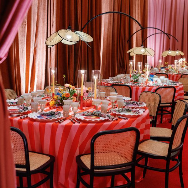
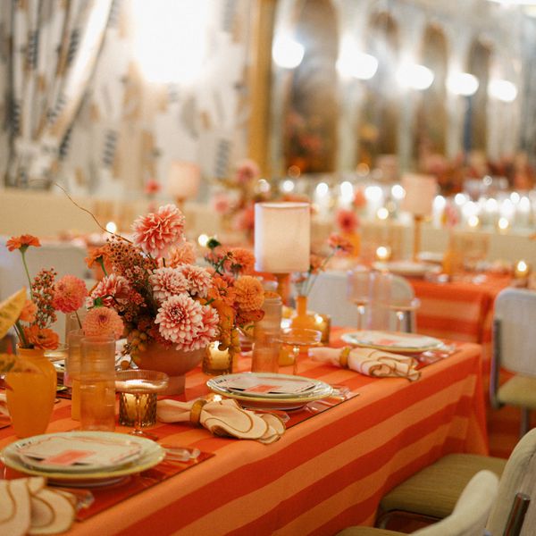
We asked Laura Ritchie, the principal designer at Grit & Grace and the queen of mindful maximalism, to take Verona Sunset all the way when ideating her mood board. As for her over-the-top vision? “Verona Sunset is a bold color and we dreamt of giving it a moment in the sun by playing up different, but similar tones across all elements so it wasn’t overwhelming,” she explains. She landed on a color palette entirely within the orange family and broke up the tonal shades with bright white for contrast; this layered approach (Ritchie splashed a lighter iteration of the tone across patterned linens, which left room for smaller details like striped plates, vibrant glassware, and lampshades to be bolder) kept the color front and center, but didn’t overstimulate the eye. “I love the idea of playing around in a monotone color palette so it’s not matchy-matchy, but more thoughtful. By using marigold and amber and sharp white, this look feels fresh and modern, but not so literal,” she adds.
If you’re interested in using Verona Sunset in a big and bright way at your own wedding, Ritchie suggests sticking to a pattern play through line. “Using this color in different patterns like stripes, wavy wiggles, and block prints could absolutely liven up any event,” she says. “Just be sure to vary the scale!” And while Ritchie stuck with an all-orange approach, she loves the versatility of the shade, noting that you could make Verona Sunset the star of the show through a myriad of other color pairings or aesthetics. “I’m obsessed with this color! It’s a versatile tone that can read preppy, modern, or romantic,” she shares. “Pairing Verona Sunset with a bold primary color like a navy could really be fun for a preppy reception that feels strong and distinct.”
Photo credits: Courtesy of Something Vintage (tablecloth, napkin, flatware, napkin rings, plates, chair, and lampshades); Courtesy of Minted (menu); Courtesy of Etsy (table numbers and place cards); Courtesy of Sir/Madam (glassware); Courtesy of Little Hill Flowers (centerpiece)
:max_bytes(150000):strip_icc()/BridesxMinted-2024-COTY-Moodboard-PunchyPastel-07806fd975ad440a8b24a3069e49d4f9.jpg)
Design by Brides
Punchy and Pastel
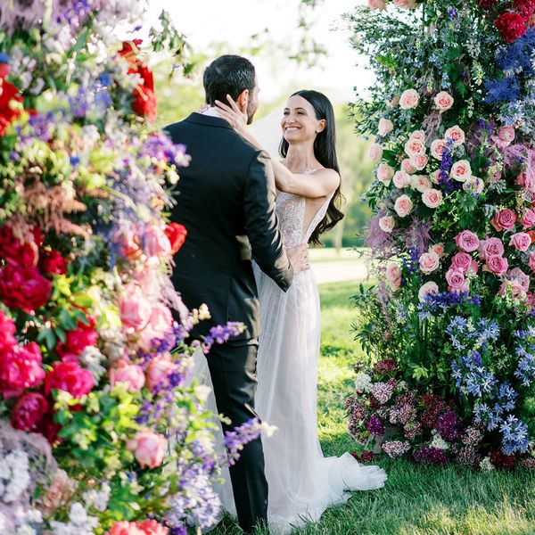
Pastel sunset anyone? That’s what Nancy Park of So Happi Together (who regularly designs soft, romantic events) envisioned when she put together a mood board that positioned our color of the year in a supporting role. She chose light lilac as her palette’s primary shade, “which works well, since it is a complementary color to the orange (and Verona Sunset!) on the color wheel,” she says. “Creamy peaches and blush pinks soften up the transition from the primary lilac to the secondary Verona Sunset—but the lilac, peach, and blush tones also act as a neutral backdrop for the orange, which adds warmth and vibrancy to the overall design. The result is a balanced palette that feels cohesive.”
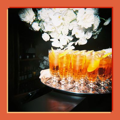
This palette and mood board, full of lush flowers, soft ceramics, and rich textures (like velvet), works perfectly for outdoor events held in the spring or summer, she explains. If this sounds right up your alley, Park says to heed this reminder: “Verona Sunset adds sophistication so long as it is balanced with softer shades that feel natural, rather than competing too much with other bold tones.” Do by finding secondary ways to weave in the shade, like working it into your floral design (making a “few key floral choices,” such as poppies, ranunculus, cosmos, and fringe tulips, will ensure the bold color is translated in a softer way), choosing an orange signature cocktail (an Aperol spritz was the inspiration behind Verona Sunset in the first place!), or strategically renting lounge furniture in the shade.
Photo credits: Courtesy of Casa de Perrin (patterned plates, lilac ceramic plate, and blush glassware); Courtesy of Heath (bud vase); Courtesy of Swell Press (wedding invitations); Photo by Butterfly Floral & Event Design (orange and purple flowers); Photo by Sally Pinera (earrings, peach plates, and hanbok); Photo by Lacie Hansen (cocktail); Photo by Daniel Kim (bride and bridesmaids with bouquets)
:max_bytes(150000):strip_icc()/BridesxMinted-2024-COTY-Moodboard-OrganicSubtle-63179d648b9a4774a2f391792e8fd58c.jpg)
Design by Brides
Organic and Subtle
When we revealed Verona Sunset to Summer Newman, the founder of Summer Newman Events, she was immediately transported to the color’s namesake country—and how Italy made her feel. “We remembered how at ease we were, how welcoming the heat from the sun felt,” she explains, noting that she aimed to carry the color’s sensory connotations over to her mood board, which features our color of the year as a quieter accent shade. “When we were asked to create a mood board that displayed this color in a subtle way, we decided to focus not only on the color itself, but how the color can be interpreted through the senses, through smell, taste, sight, and touch.”
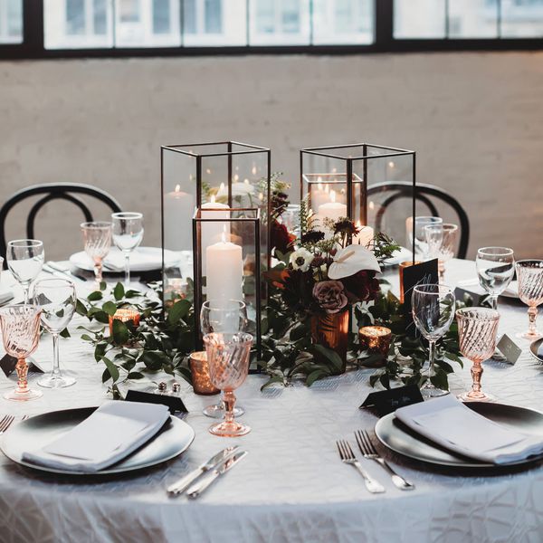
The result? A collection of organic tones that you’d find in an ancient place. There aren’t any true “bold” colors in Newman’s palette, she says; instead, she opted for neutrals, like black and tan, which she offset with soft pink and green. This softer base provided balance and allowed the smaller moments of orange—a few blooms on a cake, the border of a patterned napkin, the rim of textured plates—to come through. There are a slew of other small, but impactful ways to use Verona Sunset throughout your organic wedding design, adds Newman: Opt for orange typography on your wedding invitations, place a few orange table lamps on your reception stations, or use just a few orange flowers in your centerpieces or bouquet.
Photo credits: Courtesy of Color Theory Design Co (centerpiece); Courtesy of Natasha Nicole Studio (veil); Photo by Jasmine Rae Cakes (cake); Courtesy of Minted (wedding invitations); Courtesy of The Ark (plates); Courtesy of Adore Folklore (orange lamp, black lamp); Courtesy of Stradley Davidson (floral linens); Courtesy of Theoni Collection (black chair); Courtesy of Gucci (wallpaper swatch); Courtesy of Casa de Perrin (jute charger)

